Creating a convincing beverage advertisement with AI is about much more than placing a can in front of a tropical background.
A strong commercial product poster needs product hierarchy, packaging design, typography, lighting, material detail, negative space, and controlled supporting elements to work together.
This premium beverage poster prompt is designed around that idea.
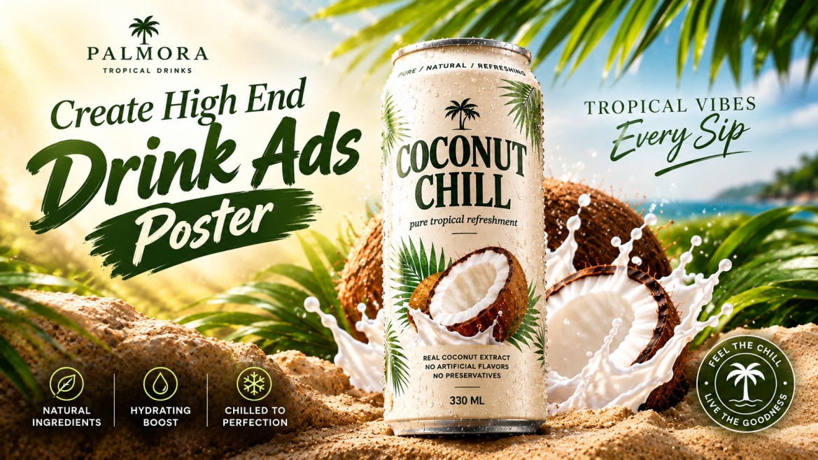
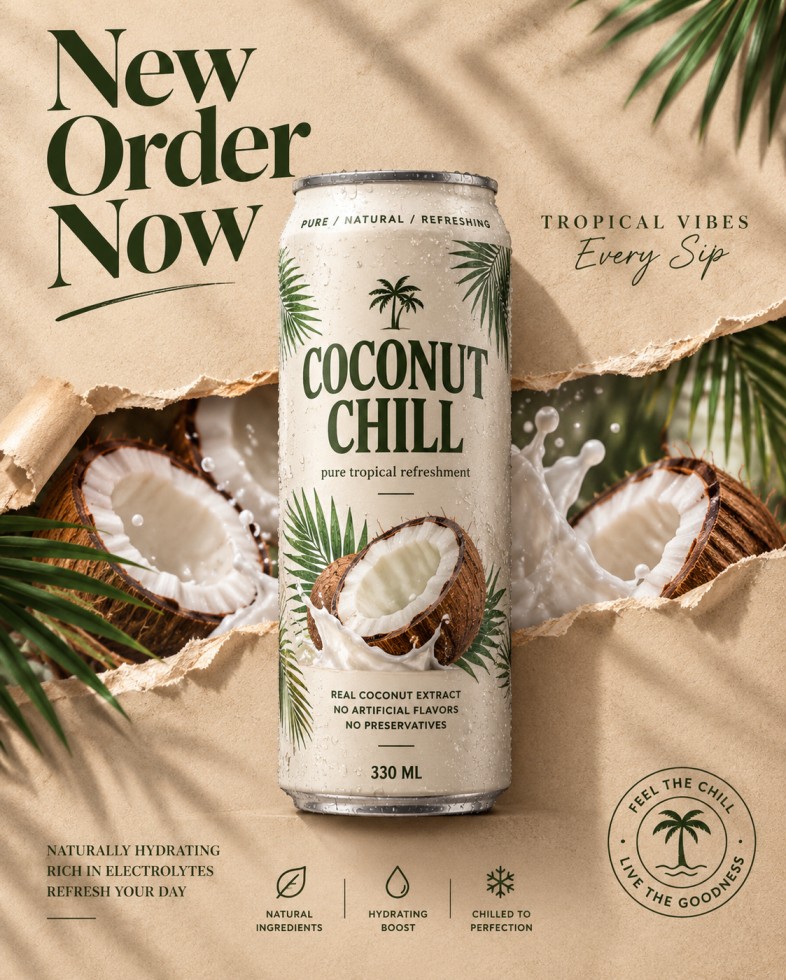
The concept uses a fictional tropical coconut drink brand called PALMORA, with a chilled COCONUT CHILL can as the absolute hero. Instead of filling the entire composition with tropical objects, the design uses a carefully controlled torn-paper reveal to introduce coconuts, coconut milk, and palm leaves behind the product.
The result is intended to feel like a polished commercial beverage campaign rather than a generic AI-generated product image.
The Concept Behind This Beverage Poster
The visual concept follows a simple hierarchy:
Hero product → structural reveal → supporting typography → information system
The beverage can remains the most important element in the entire composition.
Behind it, a horizontal torn-paper opening reveals a miniature tropical world containing:
- Split coconuts
- White coconut flesh
- Coconut milk splash
- Sparse palm fronds
- Tropical textures
The surrounding design remains intentionally minimal.
Instead of creating a busy tropical collage, the prompt uses the paper tear as a visual transition between the clean advertising world and the natural world of the beverage.
The Full AI Beverage Poster Prompt
Copy and paste the following prompt into your AI image generator.
Prompt
Why This Prompt Works
The most important part of this prompt isn’t simply the tropical styling.
It establishes a visual hierarchy that tells the image generator what deserves attention.
1. The Can Is the Hero
The prompt repeatedly protects the product:
“the real can remains the absolute hero”
and:
“Keep the can silhouette completely untouched and clearly readable.”
This is important for product advertising.
Without this instruction, an AI model can easily allow the background, fruit, splash, or decorative elements to become more visually dominant than the actual product.
For a beverage advertisement, that defeats the purpose of the composition.
2. The Torn Paper Creates the Main Visual Hook
Instead of putting coconuts randomly around the can, the prompt introduces them through a horizontal paper rupture.
This gives the poster two distinct visual layers.
Outer layer
A clean:
- Sand-beige paper background
- Minimal typography
- Product-focused composition
- Negative space
Inner layer
A tropical reveal containing:
- Coconut
- Coconut flesh
- Coconut milk
- Palm foliage
- Natural textures
This makes the tropical elements feel like part of the advertising concept rather than random decorations.
3. Negative Space Makes the Advertisement Feel Premium
The prompt deliberately leaves space around the product.
This is particularly important for the upper-left and upper-right sections.
Instead of filling every empty area with graphics, the composition allows typography to breathe.
The result should feel closer to a luxury editorial advertisement than a crowded food poster.
Negative space also gives the hero product more visual importance.
4. The Packaging Has Its Own Design System
The can isn’t simply described as a white can.
The prompt establishes:
- Matte off-white body
- Olive-green typography
- Warm-grey metal rim
- Botanical graphics
- Condensation
- Coconut imagery
- Ingredient information
- Volume information
That creates the feeling of an actual fictional beverage brand.
The combination of packaging + typography + material definition makes the product feel more believable.
5. Material Detail Makes the Image More Photorealistic
Product advertising depends heavily on believable materials.
The prompt specifically describes:
Aluminum
- Fine texture
- Metallic rim
- Controlled reflections
- Highlight roll-off
Paper
- Visible fibers
- Soft matte surface
- Torn edges
- Curled sections
Coconut
- Fibrous brown shell
- Smooth white flesh
- Natural texture
Coconut milk
- Glossy surface
- Controlled splash
- Realistic fluid behavior
These details help prevent the image from looking like a flat illustration.
6. Condensation Adds a Sense of Temperature
The tiny water droplets on the can are a small detail, but they communicate something important.
The product is supposed to feel cold and refreshing.
Instead of simply writing “refreshing drink,” the visual language communicates refreshment through:
- Condensation
- Cool-looking aluminum
- Glossy highlights
- Coconut milk
- Clean lighting
This is a useful principle for AI product advertising:
Show the product benefit visually instead of relying entirely on text.
7. The Lighting Is Designed Like Commercial Product Photography
The prompt uses a commercial lighting setup rather than generic “cinematic lighting.”
The key light comes from the upper-left.
Warm fill comes from the front.
Palm shadows fall across the paper.
The can receives controlled highlights.
The coconut splash receives refined edge lighting.
Together, these details help establish a believable studio-commercial environment.
8. The Color Palette Is Controlled
The prompt avoids using every possible tropical color.
Instead, it concentrates the visual identity around:
Warm sand beige + off-white + coconut brown + creamy white + olive green
This restrained palette is important.
A tropical advertisement doesn’t necessarily need:
- Neon green
- Bright blue
- Orange
- Pink
- Yellow
- Red
all competing simultaneously.
Keeping the palette controlled makes the product feel more sophisticated.
The Typography Is Part of the Product Advertisement
The typography isn’t treated as an afterthought.
There are several information zones.
Main headline
NEW ORDER NOW
This occupies the upper-left and provides the largest graphic element outside the product.
Premium tagline
TROPICAL VIBES
Every Sip
This balances the opposite side of the composition.
Product branding
COCONUT CHILL
This remains on the can itself and therefore functions as the primary brand identifier.
Product claims
REAL COCONUT EXTRACT
NO ARTIFICIAL FLAVORS
NO PRESERVATIVES
These provide supporting product information.
Bottom information system
NATURAL INGREDIENTS
HYDRATING BOOST
CHILLED TO PERFECTION
This gives the lower part of the poster a structured advertising finish.
The Importance of the Bottom Icon Strip
The bottom section uses three simple information blocks.
Instead of adding another large photograph or another group of coconuts, the design uses a minimal icon system.
This creates visual balance.
The bottom strip also makes the poster resemble an actual commercial campaign asset rather than simply an AI-generated product render.
The three concepts are:
Natural Ingredients
Communicates the natural positioning of the beverage.
Hydrating Boost
Communicates the refreshing functional idea.
Chilled to Perfection
Connects directly with the condensation and cold-drink visual language.
How to Get Better Results With This Prompt
AI-generated advertising can sometimes struggle when a single prompt contains a large amount of typography.
For the best result, focus on the overall composition first.
Use a Vertical Poster Format
A vertical format works well because the design has a strong top-to-bottom hierarchy:
Headline
↓
Hero Product
↓
Tropical Reveal
↓
Product Information
↓
Icon Strip
This makes the poster feel intentional instead of randomly assembled.
Keep the Product Large
The can should occupy a substantial portion of the central composition.
If the product becomes too small, the image starts looking like a tropical lifestyle poster rather than a beverage advertisement.
The product should remain immediately identifiable even when the image is viewed as a thumbnail.
Don’t Overload the Tropical Reveal
The tropical layer should contain only a few important elements.
Use:
- Split coconut
- Coconut flesh
- Coconut milk
- A few palm leaves
Avoid filling the opening with dozens of fruits and leaves.
The visual idea works because the tropical world is distilled rather than crowded.
A Useful Variation: Make It More Luxury
If you want to create a more luxury-oriented version, add this instruction at the end:
Refine the visual language toward luxury editorial beverage advertising, with restrained typography, sophisticated negative space, subtle material imperfections, controlled reflections, elegant tonal transitions, and premium art direction similar to a global fashion and beverage campaign. Avoid flashy commercial graphics and excessive visual effects.
This pushes the result toward a more sophisticated campaign aesthetic.
A More Tropical Variation
For a stronger tropical feeling, use:
Increase the natural tropical atmosphere slightly through richer coconut textures, subtle warm sunlight, fresh palm shadows, delicate humidity in the air, and brighter natural highlights while keeping the composition minimal and the beverage can dominant.
This increases the tropical character without turning the poster into a cluttered fruit advertisement.
A More Minimal Version
If the generated result becomes too busy, add:
Reduce all supporting elements by approximately half. Use fewer palm leaves, fewer coconut pieces, less splash activity, simpler icons, and more empty space. The beverage can must dominate the composition and remain the clearest visual element.
This is particularly useful because AI image generators can sometimes overpopulate a detailed commercial prompt.
Common Problems and How to Fix Them
The Can Looks Warped
Add:
Maintain physically accurate cylindrical can geometry, straight vertical edges, symmetrical proportions, realistic top and bottom rims, and a perfectly stable upright product silhouette.
The Label Text Is Unreadable
Add:
Keep all packaging typography sharp, correctly spelled, horizontally aligned, properly spaced, and fully legible from top to bottom. Do not distort, replace, or invent text.
Even with these instructions, AI-generated typography can still be imperfect. If exact advertising copy is critical, final typography can be added during post-production.
The Tropical Background Becomes Too Busy
Add:
Use only a few carefully selected tropical elements. Prioritize negative space and product clarity over decorative density.
The Paper Tear Looks Fake
Add:
Make the torn paper physically believable, with irregular but natural fiber edges, curled paper thickness, subtle shadows beneath overlapping layers, and realistic paper tension around the rupture.
The Coconut Splash Looks Chaotic
Add:
Keep the coconut milk splash physically controlled, with realistic fluid arcs, believable droplets, smooth surface tension, and no exaggerated explosive shapes.
The Image Looks Like a Cheap Stock Advertisement
Add:
Avoid generic stock-advertising aesthetics, excessive saturation, artificial glossy effects, random decorative objects, cliché tropical imagery, and overdesigned commercial graphics. Maintain restrained high-end art direction.
How to Customize the Concept for Other Drinks
The same visual structure can be reused for different fictional beverage concepts.
Mango Drink
Replace the coconut reveal with:
- Fresh mango slices
- Mango pulp
- Controlled golden splash
- Sparse tropical leaves
Lychee Drink
Use:
- Peeled lychees
- Translucent fruit flesh
- Clear liquid splash
- Minimal botanical elements
Pineapple Drink
Use:
- Pineapple wedges
- Fibrous pineapple texture
- Golden juice splash
- Sparse leaves
Watermelon Drink
Use:
- Watermelon slices
- Red fruit texture
- Controlled juice splash
- Minimal green accents
The important part is to preserve the visual hierarchy rather than simply swapping fruits.
The Formula Behind This AI Beverage Poster
A useful way to understand the prompt is:
Hero Product + Negative Space + Structural Reveal + Material Detail + Typography + Controlled Lighting
The hero product creates the advertising focus.
The negative space gives the design room to breathe.
The structural reveal introduces the product’s natural ingredient story.
Material detail makes the image believable.
Typography creates the campaign identity.
Lighting connects everything into one photographic environment.
That combination is what turns a simple AI product render into a more complete advertising concept.
Final Thoughts
A strong AI beverage advertisement doesn’t need dozens of objects or an extremely complicated background.
The PALMORA / COCONUT CHILL concept works by keeping the product simple and using the surrounding elements as supporting visual layers.
The chilled can remains the hero.
The torn paper creates the reveal.
The coconuts communicate the ingredient.
The coconut milk communicates freshness.
The condensation communicates temperature.
The typography creates the brand identity.
And the restrained color palette keeps everything visually connected.
If you’re creating beverage advertisements with AI, this is a useful approach to experiment with: start with the product, build the environment around it, and make every supporting element serve the product rather than compete with it.